Dear painters, art aficionados, and art explorers everywhere. I would never have guessed this journal would keep my interest for so long! Join me as I learn about the processes of painting, drawing and at times, the history of art.
My website is: terirobusstudio.com

8.24.2022

Portrait Practice 2


Take it or leave it ... the main thing is the practice.

I didn't like this one, but did paint it fairly quickly.


Thanks for checking in, I will be posting without much "talking",
so that will be easy ... for you too, dear reader.

Take good care!

If you haven't been, here is 
👇
please visit when you can, and sign up for my approx monthly newsletter! 

💚


👆that is a palette, badly drawn 😁


8.23.2022

New Project ... Portrait practice


My husband found a yearbook in his parents things that we have had in storage. 
It is the 1942 "Southeast Army Air Force Training Center" yearbook (for lack of a better word), 
where his Dad did training and was pictured.


We didn't know what to do with it but did not want to throw it away. I had the flash of an idea to use the photos of the cadets (and officers) as practice for portrait painting.

I admired the painter, Karin Jurick (02/09/1961 - 06/16/2021). One of her projects
was painting mugshots from her city police department, which are public record. She also did mugshots for a certain ex-president.
Her website is a beautiful thing and I encourage you to go visit.
(my link did not work, so you just have to google her)

Here is an example of one of her tiny 4x4 mugshot paintings.

eww ...

BUST-ED is Karin's blog about these paintings.


My first painting is of 
this guy -
Colonel William W. Welsh.


I actually like how this one turned out.
But for some of the upcoming portraits I painted after this  ...  I don't.

However, I am going to post them to see if I will 
see any progress.

Most of the pictures in the yearbook are about 1-inch square, some a little bigger. 
My goal is to get a subtle likeness, at least an interesting picture, 
on a small canvas (these are 6 x 8's),
with one to three brushes, not too many brushstrokes, 
and not take too long (a few hours).

I am thinking of also painting Matt's Dad, 
when I feel like I can do the painting justice.


Ok, stay tuned for the next post that will show
 a couple more paintings in the order I painted them. That is
the way I will post them, just a few at a time.

Thank you for reading and stay healthy and safe.

🎨


8.08.2022

A little blurring helps, or hinders when painting?

Greetings Studio Journal readers!

I've been painting several still life flower paintings recently. Flowers
are available (specially in the summer) and colorful and readymade for a painting.


The following pictures will show some of my work 
painting a little petunia bouquet.
I snipped them from my hanging basket, bought
early in the summer.


This sketch is to set my composition and try
a few color choices, with Blick Studio felt pens. 
I really liked how the shadow turned out!
Hope it will be as nice with paint. 🤞


Such pretty colors!


I found a panel I had made with two sheets of Arches oil paper, side-by-side, like a diptych,
underpainted with orange, each about 8 x 5 inches.

I had no notion of making two paintings, but while working
on the first one, on the left, I thought - why not try to do the same
painting with the paper on the right without wearing my glasses?

My challenge is to first mix up the paint i need, 
then take off my glasses and paint. 
Whoa! It is very difficult.

The following are the left-side painting photos in-progress 
(with glasses, before I thought of the no-glasses thing):


And these 👇 are when I began painting the right side, without glasses.
I didn't take any progress pics. 
Who can operate a camera phone without glasses? 😳
(mostly i just forgot)


I had painted a leaf laying on the table, but wiped it
(yes, i remembered to take off my glasses).


Here are the two in-progress paintings, L with glasses and R without.


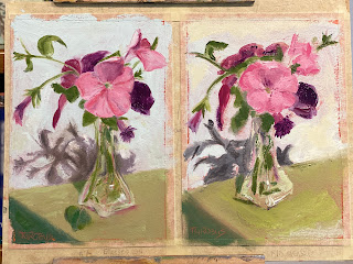
"Final" paintings (not a lot different, but a little)


Petunia Bouquet 
oil on paper
8 x 5.5 inches
(glasses on)

Petunia Bouquet II
oil on paper
8 x 5.5 inches
(glasses off)


I know which one I like the best, but actually only by a little. I think it is because I am learning to be more careful with my edges, making them not so crisp and 
on the whole, using more sgraffito & scumbling technniques
at times for a more painterly i.e. interesting, effect.


This method is very hard for me to do. I think it would take lots of planning
and patience! to do it all the time.
 But - I think it is a valuable thing to try because it 
definitely removes ANY nitpicking tendencies you i may have developed.
So I may do it as an exercise now and then.


Thanks so much for reading and for your support!
🎨

If you want to mosey over to my website:


And if you want to see new paintings before anyone else,
please sign up for my newsletter!