Dear painters, art aficionados, and art explorers everywhere. I would never have guessed this journal would keep my interest for so long! Join me as I learn about the processes of painting, drawing and at times, the history of art.
My website is: terirobusstudio.com

2.27.2021

Paint like you train

This post is probably mostly for the art/painter nerds out there, like me, 
who want to know anything and everything about art, and how to do it. 
But I hope anyone with a little interest in color will enjoy it too.


Since I have been taking several online painting workshops
during this pandemic, my husband asked me the other day,
"So how are you going to put the things you are learning into practice
when you are painting?"
(To tell you the truth, I was wondering the same thing!)

Yer Za Vue, who taught the Exploring Color workshop that just ended yesterday, 
was asked that question from a workshop attendee, 
a question probably many of us were wondering. 
She said, (paraphrased) 
"you learn all about color theory and the different ways to apply it, then you go out to paint and all of that flies out of your head and you just paint".

I mentioned this to my husband and he said, "Oh it is kind of like the military or fight saying "_ train like you fight, fight like you train _"
So I shortened the saying and replaced "fight" with "paint" and it goes:
"Paint like you train" 
... and voila! . . . the learning
comes out as you paint! (you hope)

One the many takeaways from the class with Za for me was
the idea - Temperature Shift. 
For areas of a painting that you want to keep the color without changing the value (without muddy-ing), you can shift it's temperature by adding a bit of the color next to your chosen color on a color wheel,
to either warm it up or cool it down, depending on 
what your painting needs (or what you want to make up ... i.e. artistic license).
 
Here is my exercise chart with Temperature Shift,
using a blue and a red, along with the b&w to show
the attempt to mix high key, middle key and low key value examples.


It was amazing to do the exercise and try to keep the value as close to the original as possible. And the colors on the palette were gorgeous!

Here now is the little painting I made from a source photo Za shared.


Please note this is much redder in this photo than in real life. 
Please also note the sky - where I attempted to shift the temperature 
from warm near the setting sun, to cooler as you go up.

The other really neat exercise we did was desaturation of color,
also without changing the value.


I used Green and Yellow for these. Yellow is so high in value,
it is very hard to match that, so it doesn't look quite right.

Thanks so much for sticking with this post. Do you already do these
color techniques? Do you use the color wheel? 

Happy painting and be healthy and safe.

🎨


2.19.2021

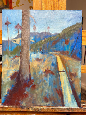
Strolling on an Eaglecrest Boardwalk

Detail from Strolling on an Eaglecrest Boardwalk

Hi all. Here is a bit of color for these gray February days!
 
A few September days in 2020 were glorious in Juneau
and we (Plein Rein Painters) met up at Eaglecrest to paint.


This boardwalk runs through the bushes and bogs 
of the muskeg and connects to trails in the area. 
I painted, not this, but another view that day, but I cannot find it, 
so maybe I painted over it or something.
Anyway ... I wanted to show you the way THIS (studio) painting developed.

Made a grid over my blue ground, for some reason I had this blue ground ...


I liked the way the boardwalk came in on the lower right
and the tree headed off the panel on the upper left.


After letting the painting sit for awhile, I asked my hubby
if he saw anything that might help the painting.
He mentioned that the trees were a little bare except for
the very tops, so I added some limbs here and there
along the trunk. They still look like Eaglecrest trees to me, too!

This month I am taking an online class learning about color. It is making me think about color more seriously than I have in the past.
For this painting, I realize it is mostly a complementary color scheme; blue & orange, with some green in there which borders on being a triadic color scheme. 
Color is so varied and amazing and each person sees color a teensy bit differently.

Strolling on an Eaglecrest Boardwalk    oil on prepared Masonite   14 3/4  x 12 1/4 inches

This painting still needs to have varnish for the darks to get some luster.


Thank you for checking in to this blog!

Stay healthy
&
Happy painting!

🎨
 

2.15.2021

Art Podcasts, are you a listener?


detail of a cold wax + oil painting in-progress

Podcasts are great to listen to while painting or walking, or vacuuming! 
(Which is what I did for awhile today.) 
And today I listened to one that fit right in to my thoughts about painting in series.

It was "The Messy Studio"

https://messystudio.fireside.fm/165

hosted by Rebecca Crowell and her son Ross Ticknor.

I listen to this podcast because: 
1 - it's about art (duh) and 
2 - Rebecca is the co-author of the book Cold Wax Medium (CWM)
and is an artist creating interesting works in CWM and oil paint ...
at least I think they are interesting. 
Plus she always has cool subjects
 to discuss.

So, this isn't a huge post but I am giving "public" notice
that I am
continuing on with my series
DOR (Dead on Road) ...
(my blogpost on Oct 1, 2020
talked about it)
 ... and the podcast was reminding me that even though
there may be a halt or a hiccup here and there,
I am still very interested in completing
at least 5 paintings for the series. 

(Each one takes quite a bit of time, because I like to layer the oil & CWM  
so it will be a slowly developing series ...
and I am ok with that.)


detail from wip CWM painting (second in series)

If you have any questions about painting in series, check out that podcast
or shoot me a question in the comments box below.

See you next time! Take good care of yourselves!

🎨