Dear painters, art aficionados, and art explorers everywhere. I would never have guessed this journal would keep my interest for so long! Join me as I learn about the processes of painting, drawing and at times, the history of art.
My website is: terirobusstudio.com

1.27.2025

Painting Jane's Bouquet

 Dear Readers,
Today I am sharing how my painting
"Jane's Bouquet"
developed.

This is how it looked right when the bouquet was delivered
to the Juneau-Douglas City Museum at opening night of our
3 Body Problem art exhibit. (I explained about the show on my post of December 31.)


When I got the bouquet home I thought it might be nice to have
it in front of a black background.

But, after I set it on my cardboard still-life plinth,
I loved the way the cardboard contrasted with the flower colors.
... and you see that by now, the poor blossoms have drooped
and faded ...


But I felt I could still capture the beauty of the original.

Here is the beginning, on a big piece of cardboard. 
It has this painting on the back, too. (eek!)


I used transparent gesso & turned the cardboard to landscape/horizontal direction.


The following photos are how the progression went.


Jane's Bouquet
Oil on cardboard
17 3/4" x 21 1/4"

I realize I didn't explain who Jane is. Jane Terzis was Professor of Art
at the University of Alaska, Southeast. She was then and is still a Master painter and Artist.
She was my major professor when I
was going for my BA in Art. My friends, Timi Johnson and Patrick Ripp also
attended her art classes, and she became a mentor for all three of us.

Jane's website: Jane Terzis

I will publish this painting in my newsletter first, then on my website. 
If you would like to subscribe (no charge for subscription) to receive my mostly monthly newsletter "Studio News" here is a link:

Keep in Touch

and my website is:

TeriRobusStudio

Thanks so much for reading, for those of you who paint, 
happy painting! For those of you who collect,
happy browsing!

Thank you all, for your support!

🎨 best (art) wishes!
xo Teri


1.26.2025

Timi Johnson - Artist Interview


Satsuma With Scissors
by Timi Johnson


Dear Studio Journal readers,
today is the 17th anniversary of this blog, my Blogiversary! 
If you haven't been here before, Welcome!
There are lots of posts that might be interesting for you, so take a peek.

Today, like the last two years, I have an artist interview for you
 (and for me since this is my art journal). 

Timi Johnson and I met in a University of Alaska, Southeast, art class over 15 years ago. We have painted together, had art exhibits together, exercised together, partied together ... you get the picture, she is a good friend.

Timi is innovative, creative, fun, a problem solver - in many ways. She is someone who I respect and admire for all the things she solves and the things she creates, and more.

So without further ado, I present -

Timi Johnson  Artist interview

How do you describe your art, and how would you describe your creative self?

    I describe my paintings and my efforts in art as expressive, abstracted representations.  I am most interested in the liminal space between barely-legible and decisive representation.  On another thought, I am as interested in the texture of the finished painting as I am in the subject, and I find that the paintings and drawings which interest me most from my past are the ones densely packed with a variety of marks.  I like scratched up old antiques as well which tracks.  

Gold Creek Rocks
by Timi Johnson

What is your medium of choice; say if you headed to your studio/workspace, what would you naturally pick up to create with?

    Oil paint is hometown for me.  So, other than a few recent forays into the water media world, the base of my work is oil paint.   It combines beautifully and unpredictably with charcoal, graphite and cold wax which continue to appear in more recent works.


Where do you think your characteristic “style” comes from? Do you think your style has changed over time?

    You know, there’s that aesthetic of imperfection as perfection that I’ve gravitated towards in all things that probably generates my preferred way of making.  When I first conceived of painting, I followed a fundamental attraction to wet paint in color and texture.  I had to find where that thing lived, and that sense of PAINT is the thing that still attracts me. In other words, I resonated with the sensations of being a painter far before I had the experience. I think my art continues to evolve toward the aesthetic that drew me initially which seems to involve increasing density and variety of mark making in addition to decisive color and energetic values.  


Where are you from, and does that affect how and what you create?

    I grew up in Colorado, both my parents are from the four corners region. I’ve spent lots of time in the high desert and Rocky Mountains though most of my painting life has been here in Juneau.  I wasn’t intentionally exposed to art or painters growing up, but I’ve always been a creative.  I guess maybe the light of the high desert and the light of southeast Alaska have been particularly inspirational for painting. I bet most landscape artists describe light as source.   


Who are your most important artistic influences?

    I think I’m working backwards here from my nascent and uneducated impression of “oil painters” as I described earlier to the artists which represent how I think things should go.  So, you know Fechin, Cezanne, Van Gogh, Diebenkorn, Frankenthaler, Giacometti, Cassat.  Currently I’m drawn to densely mark making artists like Jordan Wolfson,  Frank Auerbach (RIP), and the broader group including Russian Impressionists.  There are some very evocative landscape artists using cold wax and charcoal who I have been following on IG/ FB as well.  The colors of Ingrid Christensen.  The list goes on and on, happily.  


What are the most 1- difficult and 2- easy aspects to your work?

            1 - Difficult.  Okay, I’m a hyper and energetic person. What I enjoy  most is the zone flow of being in a really good and dynamic painting session.  For me, this takes some planning and forethought which isn’t the fun and bouncy part.  The difficult part for me is slowing down in order to get to that bouncy-fun-part, which requires some amount of reasonable planning in an uncluttered mental and physical space.  


           2 - Easy. I’m not afraid to put down thick, strong colors or textures, I don’t need to keep everything I make. I find inspiration easily and with some basic planning can usually achieve an acceptable painting.  I don’t get bogged down very often by my past paintings, I understand they are signposts of my journey and describe me when I was there.  


Does your art help you in other areas of your life?

    That’s a fish consuming it’s tail isn’t it?   I found painting and it found me.  I have new eyes; I see paintings everywhere.  Painting has brought me deep and abiding friendships. It has expanded my world in multiple dimensions. It helps design my travel and adventures.   I love everything about it.  I don’t regret for a minute giving up my treasured well-paying career as a physical therapist to hurl myself at this endeavor.


Bruce
by Timi Johnson


Thank you, Timi. Your answers are just great. You in words!!


Again, readers, please check out Timi's website:


Timi Johnson Fine Art


You can also find her 

on Facebook


on the Insta(gram)


Thank you for reading ...

All the best in art and life, make it a good year everyone!


Teri

🎨


1.08.2025

Pop-up Art Exhibit at SEALT (Dec 2024)

Hello dear reader -
This really is truly my art studio journal, where I 
keep track of shows, painting progressions, art adventures ... etc!

The following is a reminder for me, with pictures of the 
paintings I had in the pop-up art exhibit at the 
offices of the Southeast Alaska Land Trust in Juneau.

Sunny Day at Sunny Point
*Sunny Point parcel*
Oil on Masonite 
(Sold)


 December 6, 2024 was a very exciting First Friday evening!
The city of Juneau hosts the annual Christmas Gallery Walk 
with over 50 venues to walk through, buy art, Christmas gifts, eat food,
meet & greet friends, etc.

[As I mentioned in my last post (link HERE) our group show,
3 Body Problem 
opened at the Juneau-Douglas City Museum Dec 6.]

Also, that night, a very fun pop-up art exhibit happened during Gallery Walk:
hosted an event in their offices at
119 Seward Street, Suite 2
to introduce people to what the Land Trust does by
showing paintings featuring scenes in and around 
several of their parcels near Juneau.
Six local plein air painters, including me, jumped at the chance 
to get out and paint in those beautiful places.
 

Arboretum Gold
*Jensen Arboretum parcel*
Oil on Masonite
(Sold)


Admiralty Island Estuary
*Bruin Wetlands parcel*
Oil on canvas panel
(Sold)


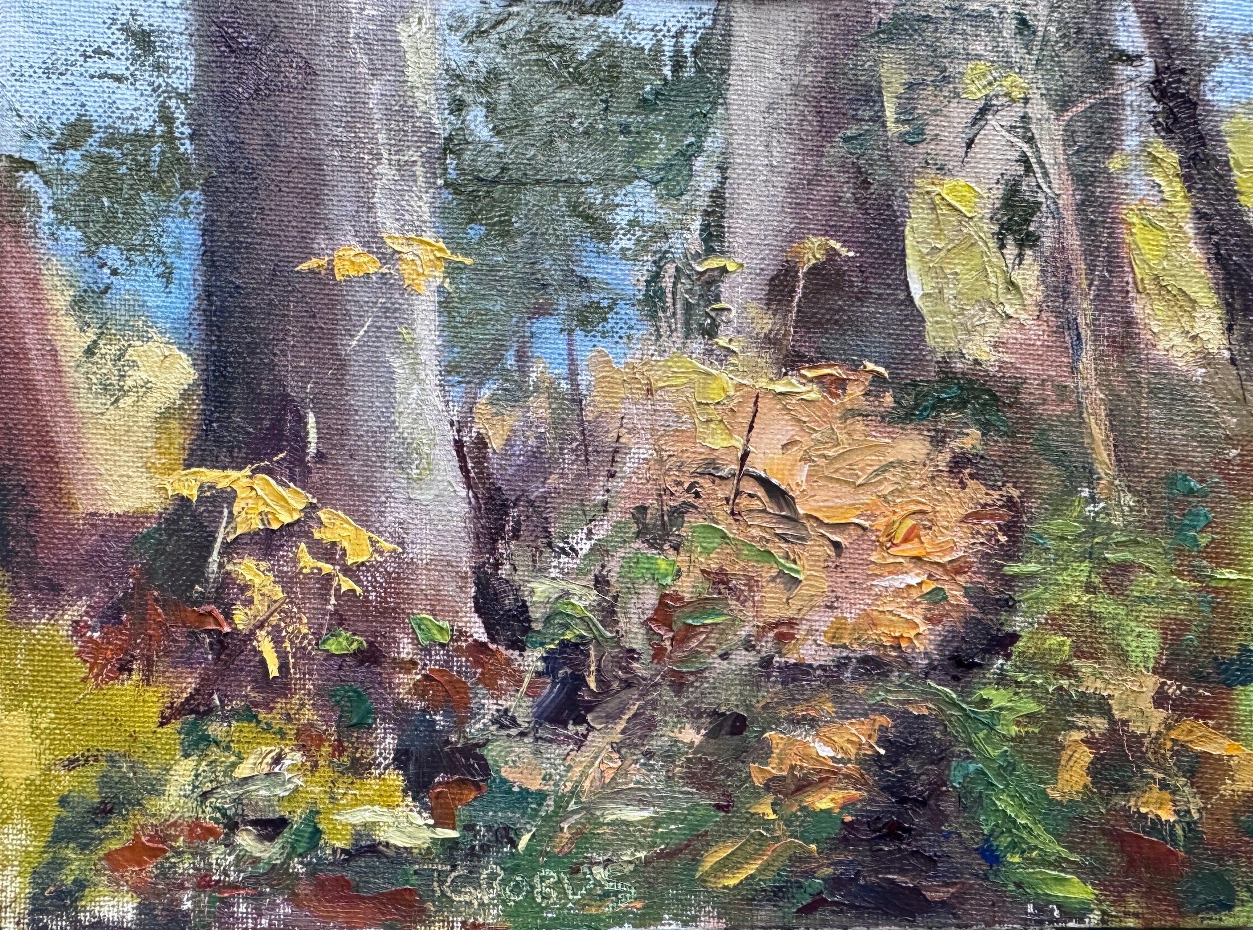
Tree with Lichen
*Vanderbilt parcel*
Oil on canvas panel
(Sold)


Late Summer Wetlands
*Sunny Point parcel*
Oil on canvas panel
(Sold)


Auk Nu Low Tide
*Auk Nu parcel*
Oil on canvas panel
(Donated to SEALT)


Strawberry Creek
*Herbert River parcel*
Oil on canvas mounted on Masonite
(Sold)


Under the Big Trees
*Montana Creek parcel*
Oil on canvas panel
(Sold)

As you can see, the show was a great success, 
not only for me - the other five artists sold paintings too. 
The show drew people in and they left informed
about what the Land Trust is and why they should care ... 
and many left having purchased a painting!

Thank you for reading my journal. Stay tuned for my blogiversary
artist interview January 26, with my good friend, Timi Johnson!

🎨


12.31.2024

Mugs (Challenge #3 - 3 Body Problem)


Hello blog readers!
A year ago in the fall (2023) my 2 friends and I were granted
a December exhibit of our Challenge paintings at the Juneau-Douglas City Museum. 

For over three years we have been meeting to pick different variables 
to make paintings that will test our creative brain.
In that time we have created 9 different challenge paintings.

This is our group statement for the show:

"We are three painters who are bound by a shared passion for painting
and meet periodically to determine our next collective painting 
project which we call a "challenge". Our process is defined
by fate, as we randomly select painting rules and limitations.

These constraints, submitted by each of us, range from possible restrictions in color; 
subject matter; media; time; size; or unconventional tools or techniques. 
These random limitations become catalysts for our personal artistic growth, 
occasionally resulting in happy accidents. 
This element of randomness adds an intriguing dimension to our work; 
forcing us to think outside-the-box and face these unique challenges head-on. 
Months later, we meet again to share our creations 
and the process begins again. 
This approach underscores our belief that art is not solely 
the product of meticulous planning, 
but can be created by unpredictable elements. 
Through these collaborations, we attempt to showcase how each artist's 
unique approach to the challenge contributes to a collective exploration of creativity."


We named our show 3 Body Problem. 
The exhibit runs December 6, 2024 through January 25, 2025.

My journal entries here, will show my own progression
through each painting ... however, 
I will not list them in order. 

The first one today is our third challenge.
The parameters were picked out of a "hat", as usual.

1. black & white palette
2. layer paper strips over a canvas in a pattern of your
choosing then paint over it allowing the
paper shapes to come through
3. still life with paint and collage items. very small diptych,
canvas no bigger than 8 x 8 or 8 x 6 inches

Mugs, original set-up


Putting on the collage pieces


Paint


Mugs
Oil and collage on panel
Left is 8" x 4", Right is 8" x 6"
9" x 11 1/4" framed

We had an amazing opening with over 200 people coming by on First Friday, December 6th. This is Juneau's Holiday Gallery Walk, so it was so exciting to have so much interest in our work. If you came by to view the show that night, thank you so much!

Stay tuned for more about our challenge paintings!

Thanks for reading! And since I am posting on New Year's Eve,

Happy New Year!!

🎨

11.12.2024

Eyes to photo to pastel to oil

Hello dear blog reader!

 In the early 2000's our family took a trip to the Oregon Coast
where we saw this tree standing all alone in a windswept meadow.


I was studying pastel painting at the time, 
so first I made a pastel work.

Old Lone Tree 
pastel   19 5/8" x 12 34"


When I began using oil paint, I again tried to capture this nice old tree.

Old Lone Tree II 
Oil on Wallis paper 10 x 8 inches


Going through paintings and papers, etc. doing a bit of clearing out,
as you do (as I do) every now and then, finding things like this is fun. 
I cleared - it seems like tons of old pastel paintings and life sketches, 
saving just a few if I liked them enough at this point in my art life.

Thank you for reading this blog. 
It is hard to keep up with everything (along with actual painting!)
now that I also have a website 
and try to write a monthly newsletter! 
In it I write about ART, and would love to
have you join me in my adventures!


See you in the next blogpost!

🎨


6.11.2024

Charting my oil paint colors


I've always thought I should have some sort of list or chart of my paint colors (oil paint). 
I have some old OLD tubes from when my brother and I were taking oil painting lessons
 (I was about 12 and he was 9 or so). Plus, I have collected many tubes of paint along the way.

So, when I received artist Todd M. Casey's The Oil Painter's Color Handbook as a gift, and read the section about doing a swatch chart ... I am now doing the charts of my paints.

It is honestly a bit easier and less complex than doing color charts like this:

from Richard Schmid's book Alla Prima II

But that is not to say I don't want and need to do those charts! I
 do! ... and someday I will, and these swatch charts will be helpful when I do.

There are instructions for how to make the swatch charts so I followed
them and they look somewhat like Todd's. My gray gesso may be a little darker
value, but that is fine.

My reason to make this a blog post is to explain it so I have a record 
of when and how I did it, and I hope it is slightly interesting for someone. 
My goal is to also post when I make my color charts, as well.


8 x 10 inch gessoed canvases taped to a panel


my blues, greens and violets 
(letting them dry before untaping the canvases)


There they are! All my oil tube colors. I have so many. 

These are the main colors I use:

Titanium White
Cadmium Yellow Light
Cadmium Yellow Deep
Yellow Ochre
Cadmium Red Light
Alizarin Permanent
Cerulean Blue
Cobalt Blue
Ultramarine Blue
Pthalo Blue
Burnt Umber

I use my extra colors that you see in my swatches every now and then; 
but I remember someone said 
that using an accent color 
is like using spice in your recipe ... you don't want too much.

If you have made swatch charts of your paints, I would love to hear about it, and
if you made color charts ala Richard Schmid, I would love to know how that went!

Thanks for reading!

If you are here through Follow It, thank you -
and if you clicked on the Studio Journal heading on my website,
then you have already seen my website. 

For those who haven't, here is the link
to look around, and thank you for looking!


🎨

5.14.2024

How I wash my brushes without solvent


Painting Tools - Still Life
oil on canvas panel
5" x 7"


Hi blog readers!
 It has been a minute since I
posted in my Studio Journal, so I thought I would post something today.

I have a YouTube video channel, which is Private at this time. But that is the way I posted the following video that could download easily for those who might be interested in how to clean your oil painting brushes without using solvent.


Thanks for watching!

... and for more paintings please check out my website:


I hope you find something you like! 
Please email me or comment here if you have any questions.

yours in art,

Teri

2.15.2024

A Valentine's Day Adventure


My Valentine's Day painting and snowshoeing adventure 
happened because the day dawned sunny,
not too cold, and windless. I have said that I am a fair-weather painter
and even though it was not 70° out, I did consider it "fair weather" because of
all the sun and no wind!!

The other thing I wanted to do besides paint outside on this lovely day was
to try out my electric socks that Santa brought me for xmas. Ever since our dog mushing days in Fairbanks, my feet have been very sensitive to the cold.

Eaglecrest ski area on Douglas Island, is a vast playground and with
all the snow we have had, I thought it might be a good place to find a winter scene to paint.

Near the lodge in the upper parking area, there was a x-country ski trail (?) that had not been used for several snowfalls, so I trekked uphill on that trail to find a spot to set up.
Once I found a good place, I trekked back to the car, got my pack
and headed up.


ready to paint standing in my snowshoes

I realized that my skinny tripod legs might sink down too deep in the snow! 
But I tested it and it held while I snapped my pochade box onto the tripod.


The first thing I saw as I surveyed the scene was a Ptarmigan! 
So white! even against the snow ... and moving very slowly because it saw me.

Willow Ptarmigan (Lagopus lagopus)
Alaska State Bird


The shadows and the sparkly snow were really enticing. I think the temperature was about 30° and the sun was at my back. I could block the sun with my body so my colors weren't washed out on my painting and palette. I'd forgotten to bring my umbrella.

My set up was pretty near the bunny hill
and it must have been a school learn-to-ski day, 
because there were recess-like playground shouts 
and happy voices echoing through the air. 

Another voice I heard echoing in the valley was
the cry of a Red-tailed Hawk (Buteo jamaicensis alascensis).


 first painting - 5 x 7


My painting went well ... so well that I was finished with this small one in about an hour.
Since I had another panel, & I was still not too cold,
I decided to try another painting.

I had to work fast because I didn't want to 
have the sun go down while I was there, or get cold. In a situation like this, 
painting as quickly as I could and concentrating
on just the big shapes with no detail 
helps me to not make the painting too tight. 

 Have you heard the saying "think slow & paint fast"?

I feel like I did accomplish that; 
For me, I got a nice representation of the feeling of being up there
in the snow with the Ptarmigan and hawk.

2nd painting - 8 x 10

The electric socks helped me to stay standing on the snow for nearly two hours. But I learned I should move around a bit more, even with the socks on (they are so neat, there's an app on my phone to turn the heat up or down!).

So here are the two paintings. I took pictures of them outside today (another nice day!).

Ptarmigan Country
oil on linen mounted on Mulitmedia artboard


Eaglecrest Valentine
oil on Masonite


Thank you for reading about my 🩷Valentine's Day adventure! 
Please let me know if you have any questions.

Happy painting and creating! 


♥♡♥

🎨